

Phil Hearn: Blogger, Writer & Founder of MRDC Software Ltd.
Crosstabs versus dashboards – which is better?
When you have survey data, is it better to gain insights using crosstabulations, crosstabs, tabulations – call them what you will – or an online dashboard? I watched an online session about crosstabulations from a market research conference a little while ago. The main presenter was keen to tell us that the crosstab is dead. If he was right, I had a serious threat to my business. So, I decided to dig a little deeper.
Are dashboards always better?
I know the expression a picture paints a thousand words. I even heard someone at a conference add to this by saying a dashboard paints a hundred thousand words. Let’s get back down to earth and compare crosstabs with dashboards more rationally. I do not doubt that crosstabs and dashboards both potentially have their place in a researcher’s toolbox – it’s not one or the other; it depends on what you are doing. Yet, I can’t find any discussions about which is more relevant in a particular situation. So, let me try to resolve that.
The advantages of dashboards
1. Sophisticated dashboards versus quick dashboards
It wasn’t long ago that building a dashboard was a complex task carried out by programmers. They took time to create and were usually time-consuming to change. Given these constraints, they were only viable for long-term tracking studies with sizeable budgets. Things have changed or, at least, have appeared to change. Getting from data to a dashboard suddenly became more accessible. Why? The tools to make a basic dashboard became readily available, making what I call basic dashboards relatively cheaply available. High-quality or sophisticated dashboards may be easier to produce than five years ago, but they still need heavy-duty software like Tableau or programmers to put in place. What’s changed is that basic dashboards are doable within the budget of many research projects; sophisticated dashboards still need a reasonable budget.
2. Ease of use
A good dashboard should be intuitive and require little or no instructions to use. One of the great benefits of dashboards is that a couple of clicks can give you a visualisation of your data. This is a significant benefit and facilitates broader access to survey data. Data is more likely to be put to greater use if anyone can open the dashboard and see a representation of the data with minimal effort.
3. Easy to view
Whilst I have occasionally found output from dashboards to be bewildering and unclear, with a decent design, data in dashboards is usually easy to absorb. The availability of filters on most dashboards makes drilling down further into the data to look at different segments or groups an easy task. In sophisticated dashboards, I have seen some highly creative outputs that allow you to visualise complex results in an astoundingly comprehensible way. However, these outputs are the exception rather than the norm as the gulf between sophisticated and quick dashboards remains.
4. Comparing data
Dashboards are good at comparing large amounts of information. This may be monthly trends or mean scores from a battery of rating scales. Summarising data in this way can show trends or compare rating scales quickly and easily. This is a real benefit – the quick comparison.
The disadvantages of dashboards
1. Too easy
Whilst dashboards often give you a quick overview of data, allowing you to look at different cuts of the data, they often give you no more than an overview. Only one or two things will likely stick in the mind. It’s too easy to move on to the next chart, another cut of the data or explore something entirely different. In other words, the ease of looking at something else makes it too easy to move on before the full impact of a chart or dashboard representation sinks in. Obviously, this is not true of everyone, but it is a problem with much of the information and data we find online.
2. Now you see it, now you don’t
Similarly, something fixed usually impacts more than something you can ‘play’ with. Although many dashboards have ways of bookmarking or saving interesting data visualisations, it is all too easy to get the overview but not absorb the detail or the hidden insights. As a business that increasingly prides itself on providing insights, this can be a weakness.
3. Limited data access
Most dashboards only contain the questions that are deemed the ‘key questions’. Just as one of the main benefits of a good dashboard is its ease of use and clarity, the amount of data available may be limited to keep it manageable.
4. Building variables
Although some dashboards allow deeper data analysis in a survey, constructing variables from questions and presenting user-generated variables in a chart are rarely available. Typically, you can only work with what you get. If you want to cut age groups, for example, differently from the way it is available in the dashboard or maybe group two age groups together, this may be impossible. This is restrictive and doesn’t allow you to explore your data as fully as you may like.

The advantages of crosstabs
1. Depth of analysis
Crosstabs allow you to analyse several questions by other data points, often demographics, time periods, segments or other key information. Limitations will vary from product to product, but in the case of our MRDCL and QPSMR crosstab software platforms, this can be hundreds of crosstabs, each with up to 30,000 rows and up to 1,000 columns. You can also apply filters to tables to look at subsets of the data, thus making the crosstabs three-dimensional rather than two-dimensional. Further, you can analyse data by more complex groups, for example, females aged 18-34 living in the north.
2. Amount of analysis
A benefit and, admittedly, a potential disbenefit is the amount of data you can generate from crosstabs. Whilst the limitations in our software are usually far beyond normal needs, most crosstab software will allow you to produce many tables with many table cells. For most products, it is generally quick to analyse surveys in more detail or with more crossbreaks (columns) if you find something worthy of further investigation.
3. Statistical data
Most crosstab software will have tools for table-based statistical tests, such as mean score, standard deviation, error variance, significance tests and more. These types of statistics are often impossible to show on dashboards and give important guidance when providing insights. Our products, MRDCL and QPSMR, have a complete set of table-based statistics with options, for example, to control how significance tests are applied and the formulae used.
4. Building variables
One of the critical advantages of crosstabs is that you can show data how you want to. Two common examples are grouping answers and combining data from one or more questions. Examples of grouping answers are where you want to combine six age groups into three groups or where you want to place makes/models into groups such as luxury, expensive, standard and budget. Combining data from two or more questions means, for example, that you can analyse high-spenders within age groups within gender as one dimension of your crosstabs.
The disadvantages of crosstabs
1. Too much data
Crosstabs produce a lot of data. If you have a crosstab with 20 rows and 15 columns, you generate 300 ‘items’ of data or a table with 300 cells. This is a lot of data to absorb – and we are only talking about one table! ‘Speedreading’ tables is a skill that can be developed, but it is easy to miss a nugget of data in a large volume of crosstabs.
2. Time-consuming to comprehend
Compared to a dashboard representation or a chart, the content of a crosstab usually takes more time to understand and, hence, utilise the findings. You might get more in-depth analysis but need more time to report results. Indeed, any findings may be difficult to share with colleagues who will likely understand any message from a chart more readily than a crosstab.
3. Density of data
Crosstabs are typically packed with data. Sifting out the crucial parts of the analysis can take time, although tools such as significance tests can help to highlight key information.
4. Unsuitable for acting on research findings
Crosstabs are seldom the end of a process. The results will need to be distilled into a meaningful presentation or report. This typically requires human effort, although AI tools are starting to simplify and speed up this task. Additionally, we are adding tools to our software to automate PowerPoint reports and generate dashboards, linking the two reporting methodologies together.
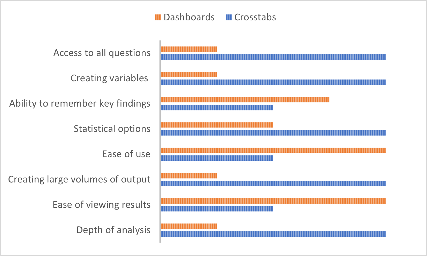
A comparison of crosstabs and dashboards
Summary
In conclusion, dashboards are an excellent way to share distilled information with a wide range of people, particularly those with different interests and skill levels. In most cases (but not all!), dashboards are usually intuitive, rarely open to misuse or misinterpretation and allow survey users to explore the central tenets of a survey’s insights. Crosstabs allow greater flexibility but need more skilled users to distribute findings. There are more likely to be tools providing rich statistical data with the ability to slice and dice data in any way you wish. Of course, any dashboard or crosstab platform will have strengths and weaknesses. The limitations and ease of use of a dashboard will tend to have a clearly defined scope, whereas crosstab platforms will tend to offer almost limitless opportunities. Our MRDCL software is, we believe, unmatched in how you can analyse and present data as crosstabs. Further, MRDCL can be built into most existing platforms so that you can create a friendly user interface capable of producing any complexity of analysis. As I stated earlier, the choice between crosstabs and dashboards is not an either/or decision; both clearly have their place to report survey data meaningfully.